
Best Muscle Cars
The Stories Behind Your Favorite Muscle Car Logos
By Martin Banks
Muscle cars each have their own distinct look, but if you get a bunch of similar-looking models in a line, how do you tell them apart at first glance? You check the logo.
Manufacturer logos are as unique as the cars they sell, and each has a rich and varied history. Let’s take a look at the stories behind some of your favorite muscle car logos.
1. Plymouth
The Plymouth Barracuda is one of America’s favorite muscle cars, but how did the brand develop its signature sailboat logo? Plymouth started as a way for Chrysler to compete with the lower-priced models Ford and Chevy had already saturated the market with. The name spoke to the country’s patriotic streak, harkening back to Plymouth Rock, where the Pilgrims first landed in the 1600s.
Plymouth didn’t get its first official logo until nearly two decades after it launched. It featured the Mayflower, and you can still see it on models that came out between 1949 and 1958. After that, it switched to model-specific logos. When Crysler tried to bring the brand back in the 1990s, it exchanged the big ship for a smaller sailboat, though the vaguely suggestive sail design didn’t do anything to endear the brand to fans.
2. Chevy
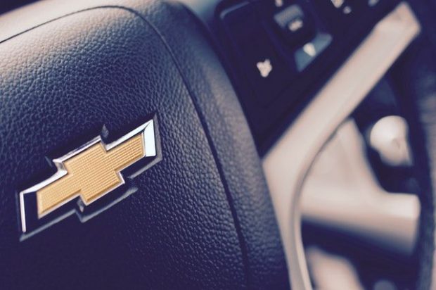
Chevy dates back to 1911 and, while founded by William Durant, was named after a famous race car driver named Louis Chevrolet. The first Chevy truck rolled off the assembly lines in 1917, and the rest is history. The funny thing about the Chevy logo isn’t its simplicity but the fact that it really hasn’t changed in the last 100 years.
The most popular story behind the gold or silver cross logo is that Durant saw the pattern on the wallpaper in a hotel room and liked it so much he tore off a piece to take home with him. It premiered in 1913 as a silver bow tie and changed to gold in 2004.
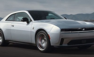
3. Dodge
Dodge is known for muscle cars and powerful trucks, but the logo that first debuted more than a century ago doesn’t look anything like the Ram we know and love today. The first Dodge logo was a six-pointed star with the letters D and B intertwined in the center. The star had a circle around it with the words “Dodge Brothers Motor Vehicles” encompassing the logo. The brand dropped this in the 1930s, replacing it with the first incarnation of the leaping ram hood ornament.
The ram adorned hoods until the 1950s, when it lost its head — or rather, its body. The ram’s head appeared on the logo until 1955, when Dodge dropped it entirely. From the 1940s to the early 1980s, you could also see a crest logo similar to a coat of arms that would pop up from time to time. This wasn’t terribly popular, but you could still find it here and there.
The crest was retired in 1981, and Dodge switched to the Pentastar logo that it shared with Chrysler and Plymouth. It changed the color to red to differentiate it from the other two brands. Dodge and Ram eventually separated, so you’ll find the iconic Ram logo on its trucks and a simple shield with the Dodge name in the middle for the rest of its vehicles.
4. Pontiac
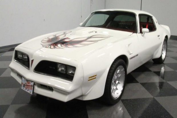
Who doesn’t love a classic Pontiac Firebird? This brand started as the Oakland Motor Car Co., which had a shield logo with the Oakland name written diagonally across it. It eventually dropped this name, and the first Pontiac logo featured the brand name as well as a Native American wearing a headdress. It used various emblems that depicted the same man wearing a headdress in multiple shapes and designs through the decades.
In 1959, Pontiac introduced the Dart, an arrowhead pointing downward with a four-pointed star in the middle. The brand never gave official reasoning for switching to the Dart logo, though some believe it’s because the star and the color red were both prominent in Native American art.
5. Ford
Ford’s blue oval logo is another one that hasn’t changed much through the decades, after its first incarnation in the early 1900s that featured an art nouveau border and a black background. By 1907, the brand had switched to the first signature-based logo, though it didn’t have the oval surrounding it that we know and love today. This made its first appearance in 1912, and the iconic blue oval appeared in 1927.
The rest is history. The only thing that’s changed over the years is that as technology advances, we’ve seen the logo become more 3D — something that wasn’t possible with the manufacturing techniques of the time. Contrary to popular belief, the logo is not Henry Ford’s signature, though it’s neat to think of his John Hancock adorning every car that ever bore his name.
Muscle Forever
As much as muscle car logos change over time, these iconic vehicles are destined to last forever.


0 comments